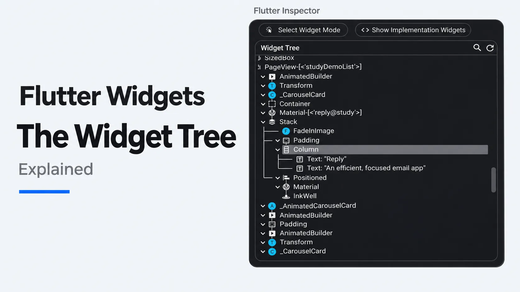
A Flutter widget describes one piece of an app’s interface. It might describe something you can see, such as a label or a button, or an arrangement, such as placing the label above the button. The Flutter widget tree is the map of how those pieces fit inside one another.
Imagine a phone on a tripod beside a training mat. An athlete finishes a jump and turns to watch the replay. Five seconds is too short: by the time they face the phone, they have missed the landing. The coach taps “Use 10 seconds”. The label changes from “Replay delay: 5 seconds” to “Replay delay: 10 seconds”, and the button now offers a way back to five.
It is a small interaction, but it raises three useful questions. What puts the label above the button? Where does the app remember the selected delay? And how can the words change while the control stays in the same place?
How do you read a widget tree?
Think of an outline in a document. Two headings at the same indentation belong to the same level. Indent a paragraph beneath one of them and you can see which heading it belongs to. A widget tree expresses a similar relationship. It also has a practical consequence: changing a parent’s layout can move everything underneath it.
Here is the part of the tree that the developer writes for the replay controls. Each level of indentation means “inside the widget above”.
ReplayControlsdescribes the delay control.Paddingleaves room around the control.Columnarranges its children vertically.Textdisplays the current delay.FilledButtonlets the coach change it.Textdisplays the action inside the button.
The Column is the parent of the first Text and the FilledButton. Those two children are siblings. The second Text sits one level deeper because it labels the button. This is how “Replay delay: 5 seconds” can be ordinary text while “Use 10 seconds” belongs to a tappable control.
You can also predict the result of a design change from the outline. Increase the outer Padding and both children move away from the screen edge. If the athlete wants more space between the label and the button, that edit belongs inside the column. Adding more outer padding would leave the two controls just as close together.
A small Flutter widget tree you can run
In a local Flutter 3.50 project with material_ui installed, put this example in lib/main.dart. It demonstrates the delay selector. You can try every interaction without connecting a camera.
import 'package:material_ui/material_ui.dart';
void main() {
runApp(
const MaterialApp(
home: Scaffold(
body: SafeArea(child: ReplayControls()),
),
),
);
}
class ReplayControls extends StatefulWidget {
const ReplayControls({super.key});
@override
State<ReplayControls> createState() => _ReplayControlsState();
}
class _ReplayControlsState extends State<ReplayControls> {
int _seconds = 5;
@override
Widget build(BuildContext context) {
final nextDelay = _seconds == 5 ? 10 : 5;
return Padding(
  padding: const EdgeInsets.all(24),
  child: Column(
    mainAxisSize: MainAxisSize.min,
    crossAxisAlignment: CrossAxisAlignment.start,
    children: [
      Text('Replay delay: $_seconds seconds'),
      FilledButton(
        onPressed: () {
          setState(() {
            _seconds = nextDelay;
          });
        },
        child: Text('Use $nextDelay seconds'),
      ),
    ],
  ),
);
}
}
To read the layout, start at return Padding. Its child is one column. The column takes a children list because it arranges several widgets. Then look at the button’s own child: that is where its label goes. The indentation in the Dart code now matches the outline above.
The first few lines provide the surroundings. MaterialApp sets up the app, Scaffold provides the screen, and SafeArea keeps the controls clear of system intrusions such as a display cutout. Developers often sketch only the branch they are discussing, even though it lives in a larger tree.
What happens when the coach taps the button?
- Before the tap,
_secondsholds 5. The label shows the current value, and the button offers the next value, 10. - On the tap, Flutter runs the button’s
onPressedfunction. The code insidesetStatechanges_secondsto 10 and tells Flutter that this part of the interface needs another build. - At the next build, Flutter calls
buildagain. This time the same Dart instructions describe a label showing 10 and a button offering 5. The padding and vertical arrangement still describe the same layout.
This is what Flutter developers mean by a declarative interface. The code says what the screen should show for the current value. The developer can change one number and let both labels follow from it. That avoids a common interface mistake: updating the displayed delay while leaving the button offering the value that is already selected.
When should a widget be stateless or stateful?
State is information the interface needs to remember as things happen. In this example, ReplayControls is a StatefulWidget because the control owns a choice that must survive a rebuild. Its separate State object holds _seconds. Declaring int seconds = 5 inside build instead would create a fresh local value each time that method runs.
A StatelessWidget can still show changing information. The Text widget in the example demonstrates this: its words change because its parent supplies a new string. It has no reason to keep a second copy of the delay. If the two copies ever disagreed, which one should the camera use?
That question helps you choose where state belongs. For this demonstration, the selector is the only owner it needs. In a working replay app, the playback system may also need the selected delay. In that case, let the screen or a playback controller own the value and pass it to the selector. If the choice must survive closing the app, save it to storage. A widget’s local state lasts only while Flutter retains the corresponding state object.
How do the widget, element and render trees differ?
The three trees answer different questions about the same button.
- The widget tree describes what to show. After the tap, a new
Textdescription says “Use 5 seconds”. Widget descriptions are immutable, so Flutter can create a new description when the value changes. - The element tree tracks what is already mounted and where. Flutter can connect a new description to an existing element at that location. This is how the replay control can receive a fresh description and keep the state that remembers 10 seconds.
- The render tree handles layout and painting. Its objects work out sizes and positions and draw what the user sees. Several widgets can contribute to one visual control, so you should not expect one render object for every widget in your source code.
A rebuild, a layout pass and a repaint are different kinds of work. Changing the delay asks Flutter to rebuild the relevant description. Whether something also needs measuring or painting depends on what changed. You cannot conclude that the camera restarted, or that the entire page was redrawn, just because build ran again. The Flutter architecture guide explains how these layers connect.
Why can state move to the wrong row in a list?
Imagine extending the training screen with a list of saved clips. A coach opens the details for “Landing”, then sorts the list by recording time. Suddenly “Warm-up” is expanded instead. Both clips are still there. What moved was the association between a row and its local expanded state.
When Flutter matches children under the same parent, it considers their widget type and key. With several unkeyed rows of the same type, their order matters. After sorting, the first row can keep the old first row’s state even though it now displays another clip.
For a column of reorderable clip rows, give each direct row a ValueKey based on the clip’s stable ID. In this illustrative line, ClipRow is the app’s own row widget.
ClipRow(key: ValueKey(clip.id), clip: clip)Now Flutter can match the “Landing” row to the same clip when its position changes. A list index would identify the position that just changed. A clip ID identifies the recording the coach actually selected. The fixed delay label and button in the earlier example have no equivalent need for keys.
How do you find the right widget in Flutter Inspector?
Suppose the athlete says the delay controls sit too far from the left edge. Open Flutter DevTools for the running app, choose Inspector, enable Select Widget Mode and select the label on the device. Follow its ancestors upward until you reach the column and its surrounding padding.
In this example, the outer Padding supplies 24 logical pixels on each side. Change that value and check whether the label and button move together as predicted. You may see extra widgets inside the button in Inspector because Flutter’s built-in controls are themselves composed of smaller pieces. Selecting the visible problem first gives you a sensible place to start. The Flutter Inspector documentation shows how to explore the live tree.
What does the tree tell you about a real product?
When I built Instant Replay, the phone could be several metres from the athlete, and a coach might operate it while wearing gloves. Those details gave the controls a concrete job: the athlete needed to recognise what the screen was showing from a distance, and the coach needed to act without interrupting the session. The delay selector above is a teaching example based on that situation.
For a mobile MVP, the same exercise works before a screen is fully designed. Pick one action, sketch which controls belong together, and write down what the app must remember after a tap. If two parts of the screen need the same answer, that is a good moment to decide who owns it. See how I approach mobile app architecture and development.