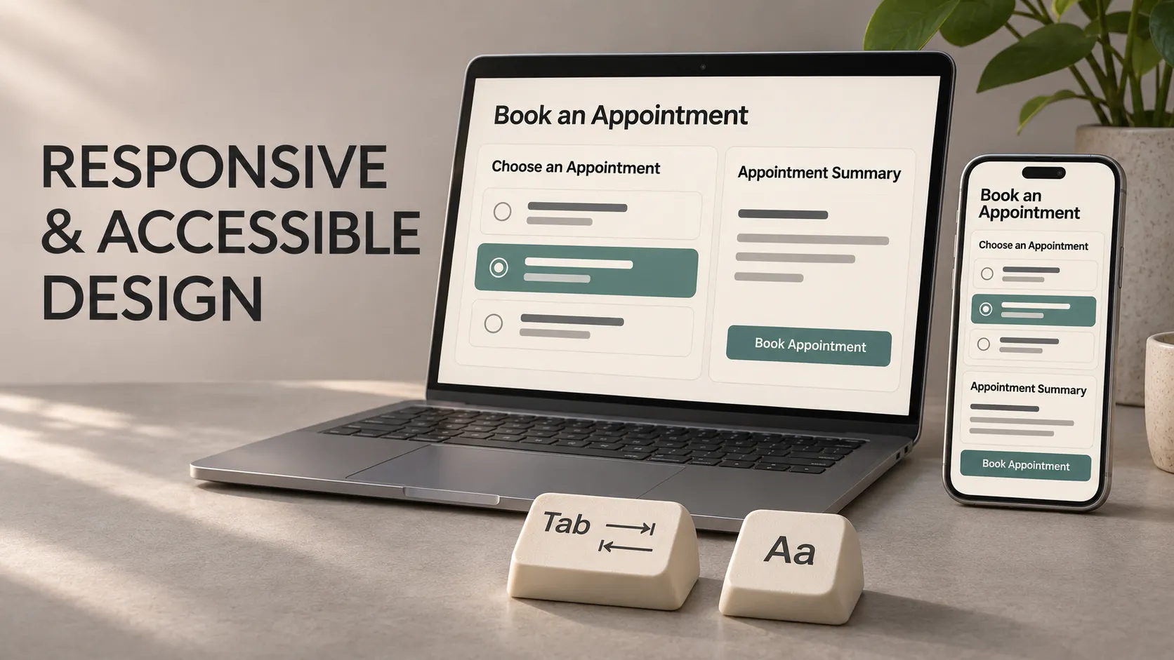
Responsive design adjusts an interface to the space available. Accessibility helps people with different abilities and ways of interacting use that interface.
Both matter when building a website or mobile app. A screen might fit a small phone while its text remains difficult to read. A button might look clear while being impossible to reach with a keyboard or identify with a screen reader.
To understand how these concerns work together, we will follow a booking app where someone chooses a service, selects an appointment and confirms the details.
An Everyday Analogy: A Restaurant Menu
Imagine presenting the same restaurant menu on a large wall display and a small printed leaflet.
Shrinking the wall display until it fits the leaflet would make the words tiny. A better approach rearranges the sections while keeping the information readable.
That resembles responsive design.
Accessibility introduces further questions. Is the contrast clear? Are the descriptions understandable? Can someone obtain the information without relying on its visual presentation?
Rearranging the menu solves a layout problem. It does not answer every question about whether people can use it.
What Is Responsive Design?
Responsive design allows content and controls to adjust as the available space changes.
For a website, that space is usually the browser viewport: the area available for displaying the page. For an app, it may be the current application window or the constraints around a particular component.
The space can change because someone:
- Uses a smaller or larger device.
- Resizes a browser window.
- Opens an app in split-screen mode.
- Rotates their device.
- Zooms into a web page.
- Opens an on-screen keyboard.
A responsive interface might place content side by side when there is enough room and stack it vertically when space becomes limited.
It should preserve the information and actions needed to complete the task.
What Is a Breakpoint?
A breakpoint is a condition at which the layout changes its arrangement.
For example, the booking app might display an appointment list beside a booking summary in a wide window. Below a suitable width, the summary moves beneath the list.
Choose that transition by checking when the content stops working comfortably. A breakpoint does not need to correspond to a particular phone model.
Device names are unreliable substitutes for available space. A tablet running two apps side by side may provide less room than expected.
Responsive vs Adaptive Design
The terms overlap in practice. Responsive design commonly describes adjusting layout to available space. Adaptive design also considers which arrangement or interaction is appropriate for the context.
For example, an app might change from bottom navigation to a navigation rail in a wider window. The aim is to keep the task usable as the context changes.
What Is Accessibility?
Digital accessibility means designing and implementing products so that people with disabilities can perceive information, operate controls and complete tasks.
Relevant needs include reading with low vision, navigating without a mouse, understanding spoken interface feedback and interacting with limited dexterity.
People may use:
- Larger text or magnification.
- A keyboard or alternative input device.
- A screen reader such as VoiceOver or TalkBack.
- Captions or text alternatives for media.
- Settings that reduce motion or change visual presentation.
These needs affect structure, language, interaction and implementation as well as appearance.
How Responsive Design Supports Accessibility
A flexible layout can give enlarged text more room, rearrange content within a zoomed viewport and keep controls reachable in a narrow window.
However, responsiveness does not automatically provide accessible names, correct reading order, keyboard operation or understandable errors.
Our booking app could stack its cards neatly on a phone while still presenting every appointment to a screen reader as an unnamed button.
Review the layout and the interaction separately, then check how they work together during the complete task.
Follow One Booking Screen Across Different Conditions
Consider a screen containing a service description, available appointment times, a booking summary and a Continue button.
In a Wide Window
The appointment choices can appear beside the summary. Keep paragraphs at a comfortable reading width instead of stretching every line across the full display.
In a Narrow Window
Stack the sections in a meaningful order. Let appointment choices wrap or use another suitable arrangement rather than becoming progressively smaller.
The customer should still be able to review the service, date and selected time before continuing.
With Larger Text
Allow labels and descriptions to wrap. Cards may need to grow vertically, and controls may need more room.
A fixed-height card that clips half the service name is a layout failure even if its outer edges fit the screen.
With the On-Screen Keyboard Open
If the flow asks for contact details, check that the active field and relevant feedback remain reachable. A bottom action area should not trap essential content behind the keyboard.
These are different conditions affecting the same task. Testing only the default screenshot misses them.
Let Content Reflow Instead of Shrinking Everything
Reflow means rearranging content within the available width, such as wrapping text and stacking columns.
For ordinary vertically scrolling web content, WCAG 2.2 Level AA includes a reflow requirement at a width equivalent to 320 CSS pixels, without losing information or functionality or requiring scrolling in both directions.
One way to examine this is a browser viewport initially 1280 CSS pixels wide at 400% zoom.
There are exceptions for content whose meaning or use requires a two-dimensional layout, such as certain maps and data tables. Those exceptions should not become a reason for an entire page to overflow.
The W3C’s reflow guidance explains the requirement and its scope.
For the booking screen, an ordinary service description should wrap. A wide decorative arrangement should not force the customer to pan sideways to read each line.
Support Text Resizing and Zoom
For web content, WCAG 2.2 Level AA generally requires text to support resizing up to 200% without losing content or functionality, with specified exceptions such as captions and images of text.
Text resizing and reflow address related but different issues. One checks whether text can become larger; the other checks how content behaves within constrained space.
In practice:
- Allow text containers to grow when content wraps.
- Avoid reducing text size merely to preserve a compact card.
- Check labels, validation messages and dialog content.
- Keep essential information available when space becomes limited.
- Avoid browser settings that prevent users from zooming.
For native mobile apps, also test the operating system’s larger text settings. Browser zoom percentages and mobile text settings are different mechanisms.
Use Sufficient Contrast and More Than Colour
Contrast describes the difference between foreground and background colours. It affects whether text remains readable.
Under WCAG 2.2 Level AA, ordinary text generally needs a contrast ratio of at least 4.5:1. Large-scale text can use at least 3:1. WCAG defines large-scale text as at least 18 point regular or 14 point bold, and specifies exceptions.
Use a contrast checker rather than estimating by eye. Check the actual text and background combination, including relevant states and themes.
Colour should also be accompanied by another cue when communicating important information.
For example, a selected appointment could include a clear selection indicator. An unavailable appointment could have an “Unavailable” label. A form error should explain the issue rather than only turning a border red.
The W3C’s contrast guidance provides the detailed definitions.
Make Controls Easier to Activate
The visible icon and its interactive area are not necessarily the same size. A small calendar symbol can sit inside a larger, clearly defined control.
Keep these references distinct:
- Web: WCAG 2.2 Level AA’s Target Size (Minimum) criterion specifies 24 by 24 CSS pixels, subject to exceptions including qualifying spacing and inline targets.
- Android: platform guidance recommends touch targets of at least 48 by 48 dp.
- iOS: platform guidance recommends touch targets of at least 44 by 44 points.
CSS pixels, Android dp and iOS points are different layout units. These figures are not interchangeable physical-pixel measurements.
A minimum threshold is also not a reason to make every control as small as possible. Appointment choices should remain comfortable to activate without accidentally selecting a neighbouring time.
See the W3C’s target size criterion for its precise exceptions.
Support Keyboard Navigation and Visible Focus
Keyboard focus identifies the control currently receiving keyboard input. Users need to see where it is and move through the interface in a meaningful order.
For a web booking flow, check that someone can select a service, choose an appointment, review the details and continue without a mouse.
Also check that:
- Focus indicators remain visible.
- Menus and dialogs can be operated and dismissed appropriately.
- Focus does not become trapped unexpectedly.
- Sticky headers or footers do not conceal the focused control.
- The navigation order still makes sense after the layout changes.
Visual rearrangement does not automatically rearrange the underlying reading or focus order. A summary moved beside the calendar must still have a sensible relationship to it.
A narrow layout also does not imply touch-only use. People can use keyboards with phones and tablets.
Give Controls Clear Names and Explain Feedback
A screen reader needs meaningful information about controls: what they are, what they do and relevant states such as selected or unavailable.
An appointment option should communicate enough context to distinguish it from the others. Repeated announcements of “button” are insufficient.
For forms, provide labels associated with their fields. Placeholder text alone is a weak substitute because it disappears as someone enters information.
Describe errors specifically. “Select an appointment time” is more useful than “Invalid input”.
Changes such as “Checking availability” or “No appointments found” may appear without navigation. Implement relevant status feedback so assistive technology can communicate it without unnecessarily interrupting the task.
This connects accessibility with the behaviour covered in user flows and screen states.
What Can You Check in Figma?
Figma can help explore layout behaviour, content hierarchy, component sizing and colour combinations before implementation.
For the booking example, prepare:
- A narrow layout and a wider arrangement.
- Long service names and expanded feedback messages.
- Examples showing how content should wrap.
- Selected, unavailable and error presentations.
- Notes describing intended reading order and control names.
Document what should happen between the example sizes. Two polished frames do not describe every intermediate layout.
Design review can identify problems early. Keyboard behaviour, actual text scaling and screen-reader output still require testing in the implemented product.
How This Applies to Flutter Apps
Flutter supports responsive layouts and platform accessibility features, but developers must use and test them appropriately.
Relevant tools include:
- LayoutBuilder: helps choose a layout using the constraints available to a widget.
- MediaQuery: provides information about the window, text scaling and other environment settings.
- SafeArea: helps keep relevant content clear of system UI and display intrusions.
- Semantics: helps expose meaning and state to accessibility services when needed.
Flutter text widgets normally respect system text-size settings. The surrounding layout still needs enough room for the resulting content.
Use established controls where they fit the task, and inspect the semantics of custom controls. Adding a spoken label does not by itself solve every interaction problem.
Flutter’s accessibility documentation provides guidance for implementation and testing.
A Practical Testing Sequence
Test the complete booking task, including a correction and an unsuccessful request.
- Change the available space: try narrow and wide windows, supported orientations and split-screen conditions.
- Increase text size: check wrapping, clipped labels, dialogs and action areas.
- Test browser zoom where applicable: inspect both readability and reflow.
- Navigate without a mouse: check operation, focus visibility and order.
- Use a screen reader: try VoiceOver on iOS or TalkBack on Android, and suitable browser-screen-reader combinations for web.
- Check feedback: trigger validation, empty results, loading and recoverable errors.
- Run automated checks: use them to find supported issues, then investigate the results.
For each problem, record the conditions, the affected task, the expected behaviour and what happened instead.
Automated checks cannot establish that every interaction is understandable or that all accessibility requirements are satisfied. Manual evaluation and feedback from people with relevant access needs provide additional evidence.
Turn the Basics Into Development Requirements
Specific requirements are easier to review than “Make it responsive and accessible”. For the booking app, examples include:
- Essential service and appointment details remain available in narrow layouts.
- Supported larger text settings do not clip labels or prevent confirmation.
- Keyboard users can complete the web booking flow with visible focus.
- Appointment controls expose understandable names and selection states.
- Error messages identify the problem and a useful next action.
- Layout changes preserve valid user selections.
An MVP can limit its feature set while defining these expectations for the journeys it includes.
Frequently Asked Questions
Is responsive design enough to make an app accessible?
No. It addresses layout flexibility. Accessible interaction also requires attention to meaning, input methods, feedback and assistive technology.
Should a mobile interface always stay in portrait mode?
Avoid imposing one orientation merely for design convenience. WCAG’s web orientation criterion allows restrictions when a particular orientation is essential. Evaluate native app behaviour against relevant platform guidance and the actual task.
Does accessibility require the same layout everywhere?
No. Layouts can differ while preserving understandable content, available functionality and meaningful navigation.
Can an automated score prove accessibility?
No. Automated results identify some issues. They need to be combined with appropriate manual checks and evaluation of complete tasks.
Make the Core Journey Work Across Real Conditions
If you are preparing a mobile MVP or improving an existing app, I can help review its interface behaviour, layout constraints and development priorities. Explore my mobile development and technical expertise to see how I can support your project.