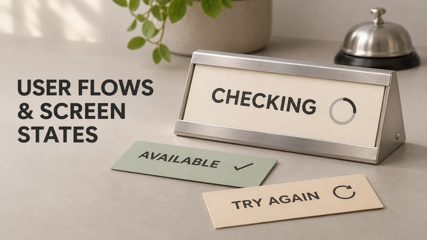
A user flow describes the steps and decisions involved in completing a task. A screen state describes what the interface shows and allows at a particular moment.
For example, booking an appointment involves choosing a service, selecting a time and confirming the details. During that flow, the same appointment screen might show loading, available times, no availability or a connection problem.
Planning both helps a team describe an app beyond its ideal screenshots. It makes clear what people can do, what the system needs to check and how someone continues when the expected result is unavailable.
An Everyday Analogy: Visiting a Reception Desk
Imagine walking into a salon to arrange a haircut.
You explain which service you need. The receptionist checks the calendar, offers available appointments, records your choice and confirms the booking. That sequence resembles a user flow.
At different moments, the receptionist communicates different conditions:
- “Which service would you like?”
- “Let me check Tuesday’s appointments.”
- “There are two times available.”
- “Tuesday is full. Would Wednesday work?”
- “Your appointment is confirmed.”
Those changing conditions resemble screen states. The conversation remains understandable because the receptionist explains what is happening and offers an appropriate next step.
An app needs to provide that guidance through its interface.
What Is a User Flow?
A user flow maps how someone progresses towards a specific goal within a product. It connects meaningful actions, decisions and system responses.
A useful flow identifies:
- The user and goal: who is completing the task and what they want to achieve.
- The entry point: where the task begins.
- The actions: what the person does.
- The decisions: conditions that lead to different paths.
- The responses: what the application does next.
- The outcome: how the person recognises that the task is complete.
For our example, the goal is “Book a haircut for next Tuesday.” The entry point could be the salon’s service list.
The flow needs more than a list of screen names. “Services, Calendar, Summary” identifies interface destinations, but leaves important questions unanswered. What opens the calendar? What if Tuesday has no appointments? Can someone change their service after selecting a time?
User Flow vs User Journey
A user journey covers a broader experience, potentially across several channels and over time. Someone might discover the salon through a recommendation, compare reviews, book through the app, attend the appointment and receive a follow-up message.
A user flow examines a more specific interaction, such as booking that appointment inside the app.
The journey helps explain the wider context. The flow helps define the steps and responses needed for a particular task.
What Is a Screen State?
A screen state is the condition of an interface at a given moment, based on relevant data, user input and ongoing operations.
It determines what information appears, which controls are available and what feedback the person receives.
Consider the appointment calendar. Before a date is selected, it might ask the customer to choose a day. After selection, it might show a loading indicator. Once the request finishes, it could display available times or explain that the day is fully booked.
These changes do not necessarily require separate pages.
Screen State vs Button State
A button can be enabled, disabled, focused or pressed. That is the state of an individual component.
A screen state describes a broader situation. For example, “booking is being submitted” might change the confirmation button, display a progress message and temporarily prevent changes to the submitted details.
Several conditions can also coexist. A screen may continue showing previously loaded appointments while displaying a small refresh indicator.
One Booking App User Flow
Start with a straightforward successful route, often called the happy path:
- The customer opens the service list.
- They choose a haircut.
- They select a date.
- The app retrieves appointment availability.
- They select an available time.
- They review the service, date, time and price.
- They confirm the booking.
- The app displays the confirmed appointment details.
This route establishes the intended task. Next, add the branches that affect whether someone can complete it:
- No appointments are available on the selected date.
- The availability request cannot be completed.
- The customer changes the service or date.
- The selected appointment becomes unavailable before confirmation.
- The customer leaves the review screen to correct a choice.
Each branch needs an understandable response and a route forward. Otherwise, the diagram may look complete while the actual experience contains dead ends.
Screen States to Consider
There is no universal number of states every screen must have. Use the conditions relevant to its task, data and dependencies.
1. Initial State
This is what appears before the person has provided the input needed to continue.
In our booking app, the calendar might display “Choose a date to see available times.” It should be clear that availability has not yet been requested.
An initial prompt is different from an empty result. The customer has not searched yet.
2. Loading State
A loading state communicates that the app is waiting for information or completing work.
After the customer selects Tuesday, a message such as “Checking available times” explains the wait. A suitable progress indicator can reinforce that message.
Keep the service and date visible so the customer understands what is being checked. Where appropriate, let them change their selection or leave rather than blocking the entire interface.
Loading should also have defined outcomes. An indicator that continues indefinitely gives the person no way to understand or resolve a problem.
3. Content Available State
The request succeeds and the app has relevant information to display.
The calendar now shows three appointment times. The selected time should be distinguishable from the other available options, and the next action should be clear.
Make sure the displayed results belong to the currently selected service and date. If the customer changes from Tuesday to Wednesday while requests are pending, a late Tuesday response should not appear as Wednesday’s availability.
4. Empty State
An empty state means there is no relevant content to show in the current context. The operation may have completed successfully.
“No appointments available on Tuesday” is an empty result. “We could not check Tuesday’s appointments” describes a failure to obtain a result.
For the empty result, offer a useful next action, such as choosing another date. Repeating the same request may not help when the day is genuinely full.
5. Validation State
Validation feedback explains why an input or selection needs attention.
If the customer has not selected an appointment time, the interface should explain what is missing. Depending on the design, this might involve a persistent instruction or feedback after an attempt to continue.
A disabled Continue button without any explanation can leave someone unsure whether the app is broken or waiting for something.
6. Submitting State
After the customer confirms, the app communicates that it is processing the booking.
This state should make repeated tapping unnecessary. For example, the confirmation control can change to “Confirming appointment” while the submitted details remain visible.
Preventing repeated taps helps the interface, but duplicate-booking protection also requires appropriate handling by the booking system.
7. Confirmed State
A confirmed state communicates that the intended operation has succeeded.
For this example, show the booked service, date and time, with a booking reference if the system provides one. The customer should understand what has been arranged and where to find it again.
Display confirmation when the system has established the booking outcome. Pressing the Confirm button alone does not establish success.
8. Error and Recovery State
An error state explains an unsuccessful operation and offers an appropriate response.
If checking availability fails, the app could preserve the selected date and provide a Retry action. If the chosen appointment has been taken, it should instead explain that the time is unavailable and offer alternatives.
These situations need different recovery paths. A generic “Something went wrong” message hides information that could help the customer continue.
9. Offline or Outdated Content State
If the app knows it is offline, it can explain which actions remain available. Previously loaded appointment times should not be presented as newly verified availability.
Where cached content is useful, label its limitations and define when it must be checked again.
Do not describe every failed request as an internet problem. The connection, server or another dependency could be responsible.
How Actions and Events Change Screen States
A transition is a change from one state to another. It can be triggered by a user action or an event from the system.
For the availability screen:
- Selecting a date starts an availability request and displays loading feedback.
- A successful response containing appointments displays the available times.
- A successful response containing no appointments displays an empty result.
- A failed request displays recovery feedback.
- Selecting Retry starts another request for the relevant selection.
For every important transition, ask: what triggered it, what changes on screen, what remains available and what can happen next?
This connects the flow diagram to behaviour that designers can represent, developers can implement and testers can verify.
What If the Booking Outcome Is Unknown?
Some interruptions leave the app uncertain about what happened.
Suppose the server creates the appointment, but the connection drops before the confirmation reaches the phone. The customer sees no confirmation, even though the booking exists.
Immediately declaring failure and inviting a fresh booking could create confusion or a duplicate appointment.
The product needs a way to resolve that uncertainty, such as checking the booking status or retrieving the customer’s appointments. The interface might temporarily explain: “We are checking whether your appointment was confirmed.”
The exact implementation depends on the booking service. The design decision is to recognise an unknown outcome instead of treating every interruption as a confirmed failure.
How to Document a User Flow
Begin with one goal and write the successful sequence in plain language. Add meaningful decisions, system responses and recovery routes before refining the visual presentation.
Common diagram conventions include:
- Ovals: entry points and outcomes.
- Rectangles: actions or screens, according to the diagram’s key.
- Diamonds: decisions with labelled branches.
- Arrows: the direction of progression.
Define your notation and keep it consistent. Distinguish “Customer selects a time” from “App checks availability” so the reader can identify who performs each step.
A diagram can use simple shapes. A wireflow adds rough screen representations to make the interface context clearer.
Tools such as FigJam and Figma can help organise these materials. If you are new to their role, start with what Figma is used for in app development.
How Screen States Relate to Flutter Development
Flutter builds its interface to reflect the application’s current state. When relevant state changes, the framework can rebuild the affected interface.
For the booking screen, the implementation might track the selected date, available appointments, whether a request is pending and whether a recoverable problem needs to be shown.
The design does not prescribe a particular state management package. It describes the behaviour the implementation must support.
Separate the UI’s representation from the underlying business outcome. A displayed selection is a customer preference; a confirmed appointment requires agreement from the booking system.
The official Flutter explanation of declarative interfaces introduces this relationship between state and UI. For the waiting and failure behaviour behind these screens, see async programming and error handling across an app.
Make State Changes Understandable and Accessible
A state change needs to be perceivable. A loading indicator, error message or success notification may appear without opening a new screen.
Use clear text alongside visual cues. An appointment should not become recognisably unavailable only because its colour changes.
In the implemented interface, ensure relevant status updates can be communicated through the platform’s accessibility mechanisms. Check that feedback remains understandable with assistive technology and enlarged text.
For web interfaces, the W3C’s guidance on status messages explains how updates can be announced without requiring users to move focus to them.
Turn the Flow Into Acceptance Criteria
Acceptance criteria describe observable behaviour that the team can review and test.
For our booking feature, examples include:
- When availability is being checked, the selected service and date remain visible.
- When the response contains no appointments, the screen explains this and offers another date selection.
- When an availability request fails, retrying preserves the relevant customer choices.
- When the customer changes the date, results from an earlier selection do not replace the current results.
- When the customer returns from review, valid previous selections are preserved and availability is rechecked where required.
- When a booking is confirmed, the displayed details match the confirmed result.
These statements make scope more concrete than “Build the booking screen.” They also reveal dependencies that a polished mockup might leave unspecified.
How Much Detail Does an MVP Need?
An MVP can support fewer journeys while still providing a complete experience for its chosen task.
The first booking release might support one location and a small service list. Multi-location search and loyalty rewards could wait. Customers still need understandable responses when availability is empty, a request fails or their selected appointment is no longer available.
Prioritise the states and recovery paths required by the included features. Keep separate flows for separate goals rather than forcing the entire product into one unreadable diagram.
A flow is a working design model, not proof that the experience is intuitive. Walk through realistic tasks with likely users, observe where they hesitate and update the model when the evidence suggests a better approach.
Frequently Asked Questions
Does every screen need loading, empty and error states?
No. A static information screen may not need them. A screen retrieving appointment data usually does. Define states according to what the screen actually depends on.
Can a state change happen without a tap?
Yes. A response arriving, a connection changing or background data being refreshed can affect what the interface displays.
Is the shortest user flow always better?
No. A useful review step can help people catch mistakes. Evaluate whether each step supports the task rather than judging the experience only by its number of taps.
Should a flow include every possible interaction?
It should cover the detail needed for its purpose. Document important branches and recovery routes, then use supporting notes or smaller flows for details that would obscure the main task.
Define What Happens Beyond the Main Screens
If you are planning a mobile MVP or reviewing an existing app, I can help clarify its user flows, missing screen states and technical dependencies. Explore my mobile development and technical expertise to see how I can support your project.